Auggie’s Mini Donuts Menu
Illustration – Typography – Layout
Auggie’s Mini Donuts is a local company located in St. Augustine, FL. The owner requested the creation of business cards and a menu redesign. The menu needed to show the mainstay menu items and have a blank space for writing, as the shop sells different drinks and donut specials seasonally. The biggest challenge involved the organization of information, as prices change by size and topping. Located in front of a trolley stop on St. George Street, the donut shop primarily targets tourists. The primary audience is either teenagers, young adults, or families with smaller children. The unique way the shop serves its donuts was the primary inspiration for the menu design; small “boats” cradle one or two skewers of 6 donuts. Because the primary menu is divided into 4 price points, the menu was designed to look like the donut “boat” – four illustrated donuts sit in a boat, housing the menu listings of each price point. Each donut is illustrated in the style of that section’s best-selling topping. The “boat” is left lightly colored, featuring the company logo in one corner; it will be covered in a type of plastic sheet to allow dry-erase marker writing for specials. Lastly, because the donuts are skewered, a wooden rod is attached to the back of the menu that doubles as a method of hanging the menu up for display. The business cards keep the colorful nature of the business and feature a mini donut on the card itself. A playful menu and business card only accentuate the colorful and fun nature of Auggie’s Mini Donuts as a store, and the eye-catching illustrations coupled with a more organized way of presenting information will certainly cut down on order times and lead to more efficient explanation of the shop’s unique concept.
Menu Design

A Business Card You’ll Want to Keep
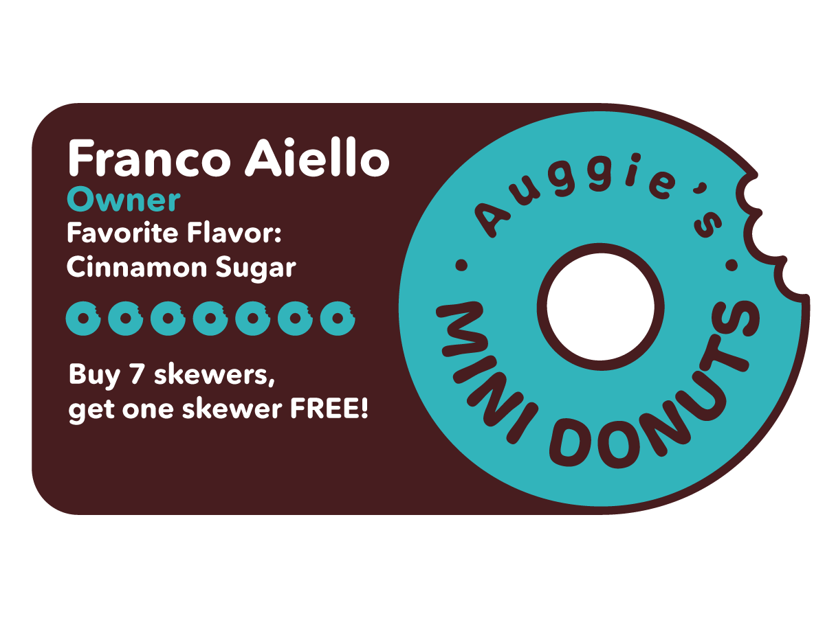
The business card was created to double as a punch card. Every skewer the customer purchases counts as one punch, and once they have accrued 7 punches, they get one skewer for free. This incentivizes the customer to keep the business card longer.
Design & Development
I worked with the company’s owner and discussed what he’d prefer for his menu design. He told me to get as creative and funky with it as I could, as long as the menu items were legible and there was a space that specials and drinks (which changed with the season) could be written on and erased.
My final concept was their iconic donut “boat” holding 4 donuts, each of which has a best-selling or popular topping from its respective category on it. The category names were my creation, and added to the fun aspect of the shop. The menu would be suspended on a wooden dowel that looked like a skewer, and hung from wall-mounted hooks.
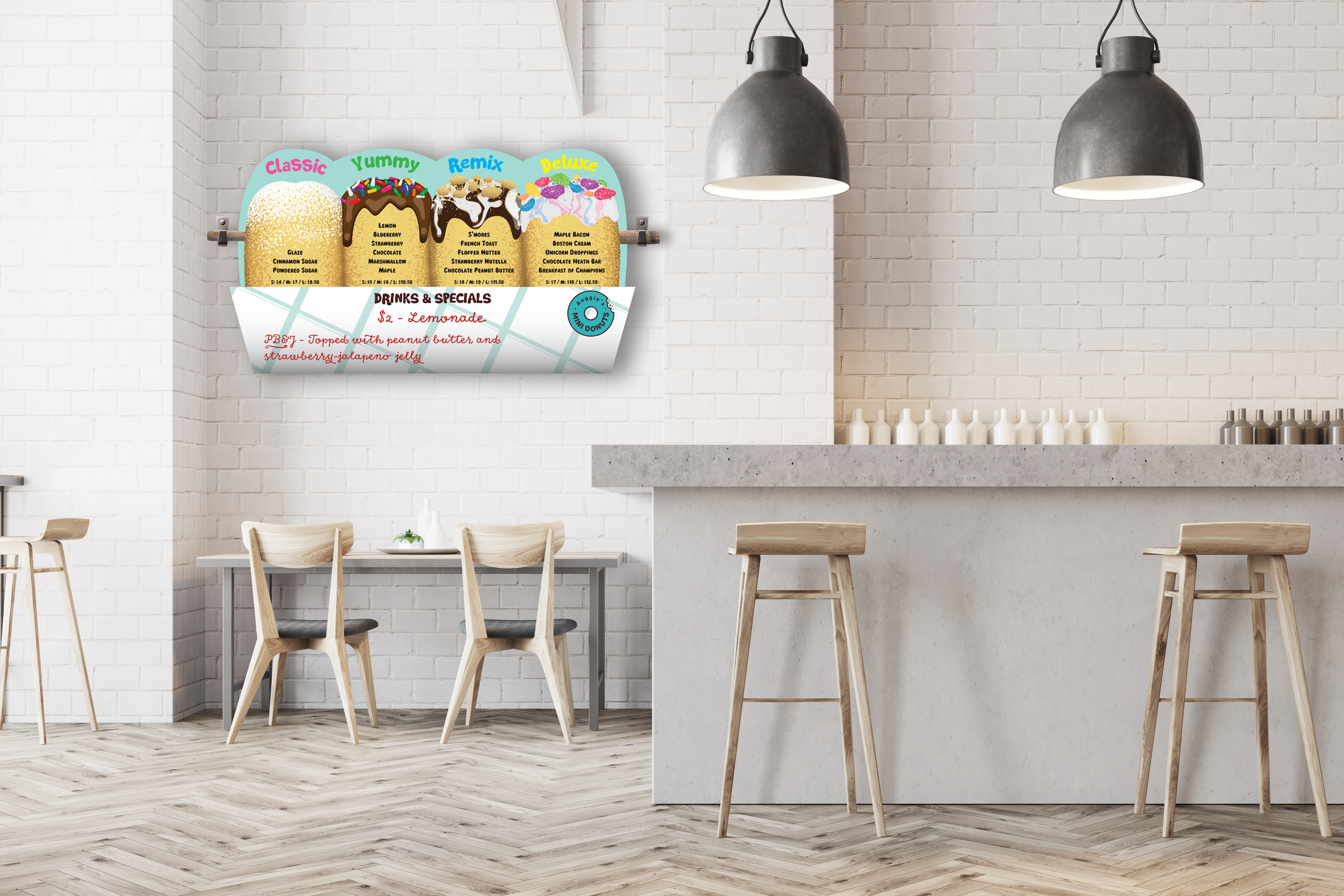
A mockup of the menu design.
More Work
